Introduction
A free companion tool for readers who can recite Quranic Arabic but cannot understand it.

LearnQuranWords.com is a free, no sign-up required web tool designed to help users learn the 600 most common/essential words in the Quran. These words reportedly make up around 80% of the Quranic text, allowing readers to understand the Quran more deeply by building core Arabic vocabulary.
My Role
Sole designer and builder from problem framing, interface design, build direction, accessibility, analytics Timeline: 4 weeks, evenings and weekends
Live url : learnquranwords.com
The Problem statement
Millions of people (mee too included )can read Quranic Arabic aloud without understanding what they are saying. The standard remedy is vocabulary: roughly 600 high-frequency words account for a large majority of the Quranic text, so learning them unlocks meaning faster than learning grammar first.

But frequency lists are not the hard part. The hard part is that Quranic Arabic is full of words that look and sound almost identical, and learners quietly conflate them.
Working through the 600-word set, I found the confusions cluster into three failure modes:
Vowel shift — the consonantal skeleton is identical; only the short vowels differ, and short vowels are the first thing a fast reader stops attending to.
One-letter swap — a single consonant differs, often one that is hard to distinguish for non-native speakers.
Letter addition or removal — the same root with one extra or missing letter, changing meaning or grammatical function.
These are from my own experiences and some warnings I've heard from people who teach Quranic arabic
Validating the demand

Repeated Instagram advertising for "learn Quran through 600 words" indicated commercial interest in the approach. Google Trends for "Learn Quran" and "Quran Words" showed sustained search interest over five years. A paid ebook on the topic (₹299) ranked highly for "600 words of the Quran" with 2.7K reviews, indicating willingness to pay.
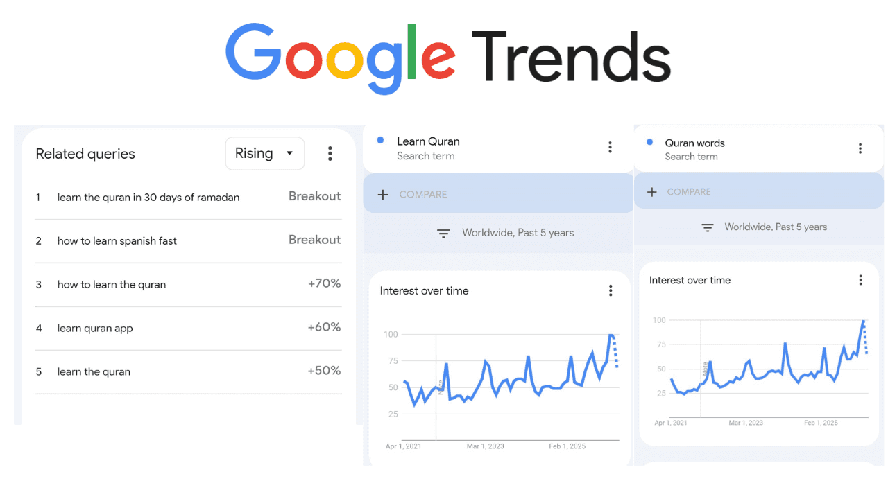
What this supports: that a market exists.
What it does not support: anything about how learners actually struggle, where they drop off, or whether my solution fits them. I labelled this "validation" in an earlier draft, after a peer review, I'm convinced It isn't. but it is demand evidence.
Market Research
There seems to be these existing competitors for the idea of a free companion to learn to read the Quran
1) Quran 600 Words

Link : https://www.quran600words.com/
This is a free app with structured learning approach including quizzes, flashcards etc. but is not accessible to non apple users.
2) Kalamullah.com

Link : https://www.kalamullah.com/80-percent-of-quranic-words.html
This website offers the 80% words as one of it's website offerings as a downloadable PDF.
User Painpoints
The user is left with only 3 options
1) Buy the e-book or a physical book.
2) Download an app from Apple app store.
3) Download a lengthy free pdf and learn through that.
Proposed Solution
I'm proposing my website,(https://www.learnquranwords.com/) as a starting step and companion in the learning journey of the people who are interested to learn Quran through exploring words, quiz and also a set of confusing pairs.
Design decisions
1) One word per visit, on the homepage

The audience includes people with low commitment to a formal course. A homepage that opens onto a curriculum asks for a decision before the user has any reason to trust the product.
Other options : a structured lesson sequence with progress tracking; a spaced-repetition queue; a single focal word refreshed on each visit.
2) A dedicated page for similar-sounding words
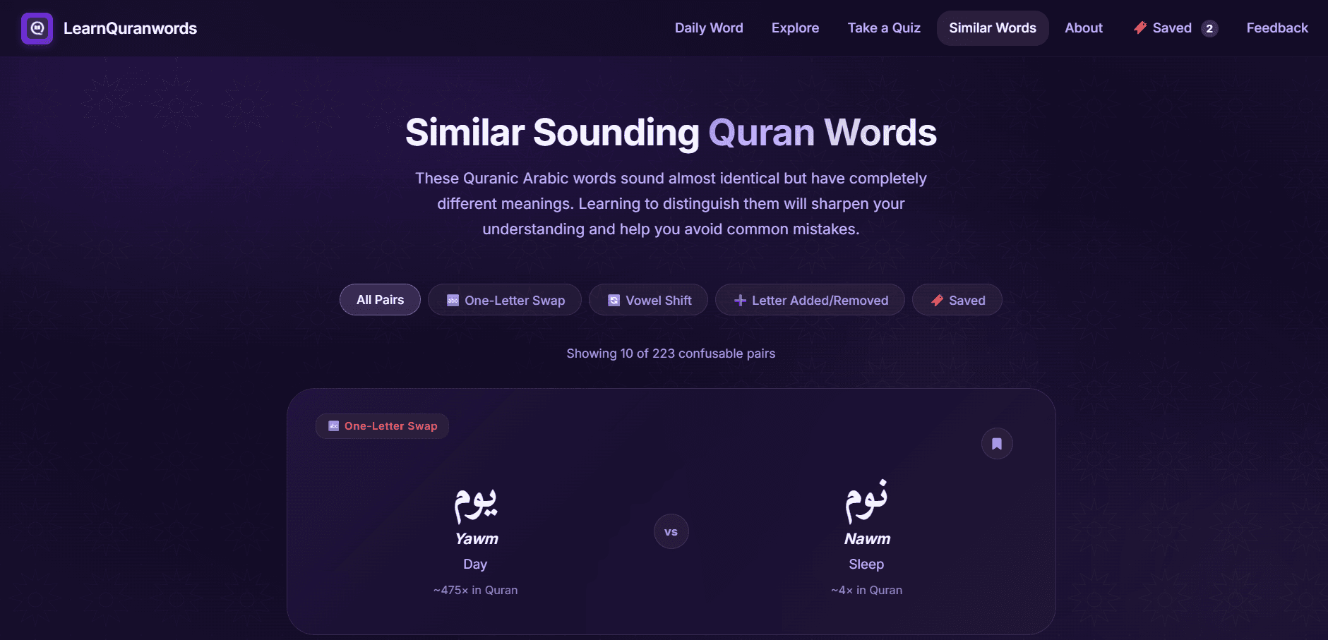
the confusion taxonomy above is the product's core insight, but confusable pairs are invisible in an alphabetical or frequency-sorted list. the whole point is that they sit apart in a list and collide in the reader's memory.
Other options : flagging confusable words inline
3) Sorting the repository by meaning and by frequency

Arabic alphabetical order is unusable for a learner who does not yet know the alphabet well.
Other options : sorting by Arabic root words
4) Quiz page

A browse-only tool gives the learner no feedback on whether anything is being retained. recognition is not recall. Multiple choice measures whether a user can pick the right meaning from four options, which is a substantially easier task than producing the meaning unprompted.
This also helps with increase session time and average view duration.
5) Local cookie-based saving instead of accounts
Sign-up is the largest drop-off point for a free tool nobody has heard of, and I did not want to hold user data.
How did I build this?
30 Day Post Launch Analysis
GA4 shows user activity spikes only on promotion. The first spike followed a WhatsApp share on 6 May 2026; the second followed a Product Hunt launch and corresponding post on X on 28 May 2026. Between spikes, traffic returns to baseline.
The honest reading: the product has no organic acquisition. Every user so far arrived because I personally pushed them there. For a free tool with no marketing budget, distribution is a harder unsolved problem than the interface was, and no amount of design work on the product itself addresses it. This is the single largest gap between what I built and a product that matters.

Microsoft Clarity recorded dead clicks and quick-backs in approximately 12% of sessions.
Two hypotheses explain this, and they have very different implications:
Exploratory behaviour. Promotional traffic arrives without a specific goal and clicks around experimentally. If true, the signal is largely noise and will fall as traffic mix normalises.
Affordance failure. Users are clicking elements that appear interactive but are not most plausibly the large centred Arabic word on the homepage, or non-clickable regions of the word cards. If true, this is a defect affecting one in eight sessions.


Continual Improvement Practices
I do these things regularly to ensure my website keeps improving and give the best User experience possible.
1)Accessibility Audit through WAVE (By WebAIM)

2) Lighthouse Audit (PageSpeed Insights)

I run automated audits regularly — WAVE (WebAIM) and Lighthouse via PageSpeed Insights. Both pass. I'm also aware that automated tests will cover every problem. So I have added a feedback button leading to a google form to report issues.

Conclusion
This is my first complete project that marks my transition from a UI/UX Designer to a Product Designer and builder, providing me a massive upskill through introduction into areas like Coding, Accessibility, SEO, Analytics etc. Thanks for taking the time to read this case study.