Redesigning ohvaz.ro for "her" ( To influence a 20% increase in AOV and overall conversion rate )
I happened to take a course on O'Reilly from Mr. Cristan Doru Barin on Mastering Web Design in Figma in which I could do this redesign of his website. In this project I redesign the website for Ohvaz to appeal to the female audience more.

About Ohvaz

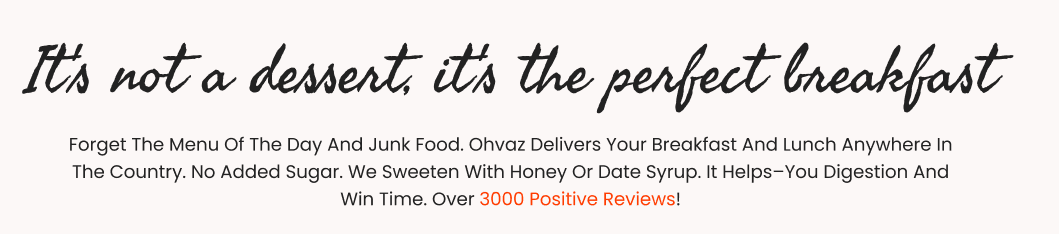
Ohvaz ( https://www.ohvaz.ro/ ) is a Romanian healthy food startup founded in 2018 by Cristian Barin, specializing in oatmeal-based products including puddings, cookies, and granola with no added sugar and no preservatives. The company achieved €720k in revenue in 2023 with 16 employees, operating primarily through direct-to-consumer sales via their website ohvaz.ro.
The company operates in the competitive healthy food market with products available through their website, major hypermarket chains like Kaufland, and food delivery platforms like Wolt. With over 5,000 positive reviews, Ohvaz has established credibility in the health-conscious consumer segment.
Challenge
As per Google analytics, the site receives more than 80% website traffic from working women, but the design of the website seems to have a neutral approach in design.
Research
As per a study conducted by Marketing Dive, more than 1,000 millennial women and moms, as well as boomers and Gen-X women, illuminated that this generation truly connects with visual and video elements.
Link to full article : https://www.marketingdive.com/ex/mobilemarketer/cms/opinion/columns/23441.html
According to a research paper published in 2024 titled, "Consumer perception towards digital food application services among working women" reveals that working women in their 30s exhibit specific purchasing behaviors relevant to food products:
Frequency: Millennial women purchase food online 2-3 times per month on average, with higher frequency during busy periods
Spending: They typically spend between Rs. 1,000 to Rs. 1,500 (approximately €11-17) per order
Motivation: 40.6% prioritize ease and convenience as primary factors for choosing online food applications
Product Preferences: Fresh foods, including fruits and vegetables, represent 70.2% of online food purchases, with females purchasing slightly more than males.
Link to paper : https://www.e3s-conferences.org/articles/e3sconf/pdf/2024/21/e3sconf_icecs2024_01019.pdf
Solution
To redesign the website of Ohvaz to appeal more to working women in their 30s as they contribute to 80% of the website traffic.
Process
Let’s see what to change.
1) Square Edges
Square Edges are sharp and rigid and hence give a more masculine feel.
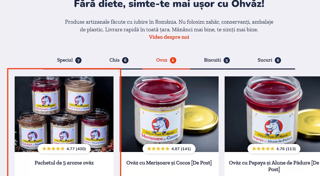
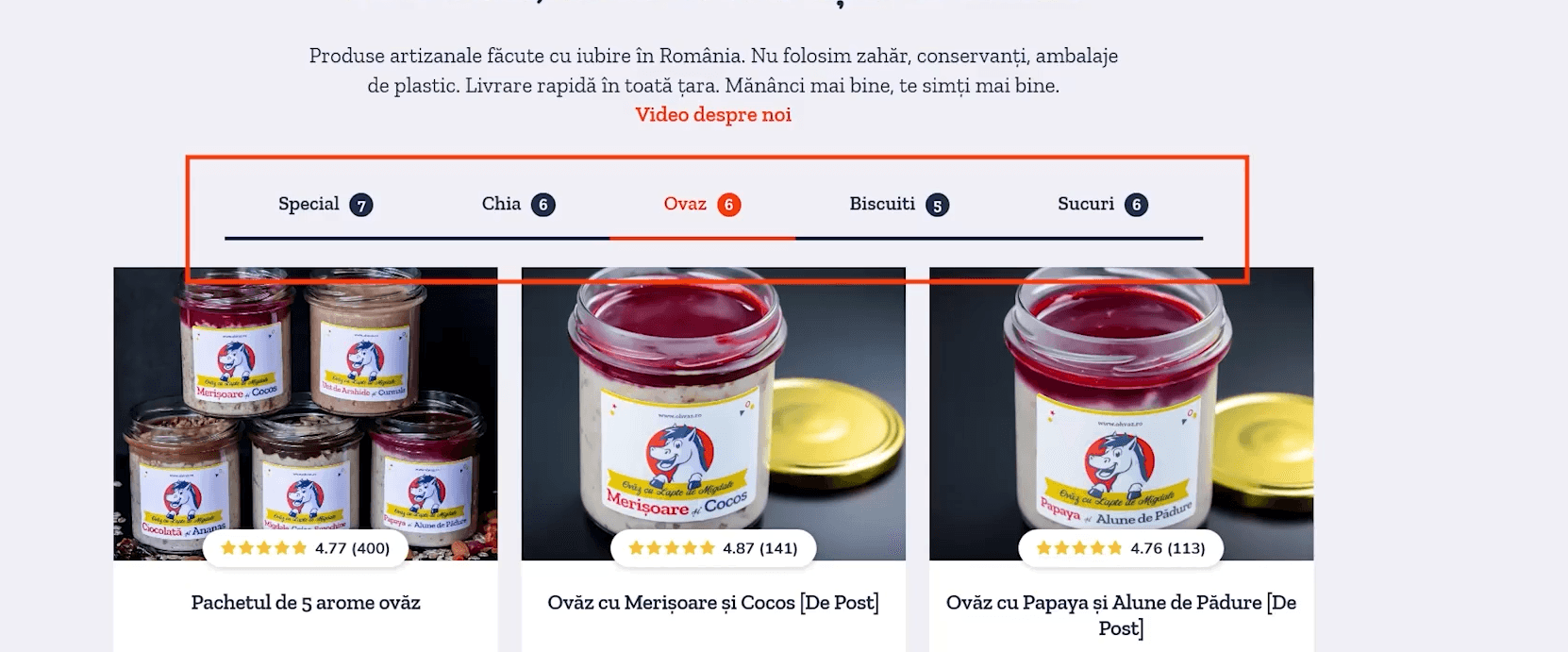
2) Dark line for category navigation
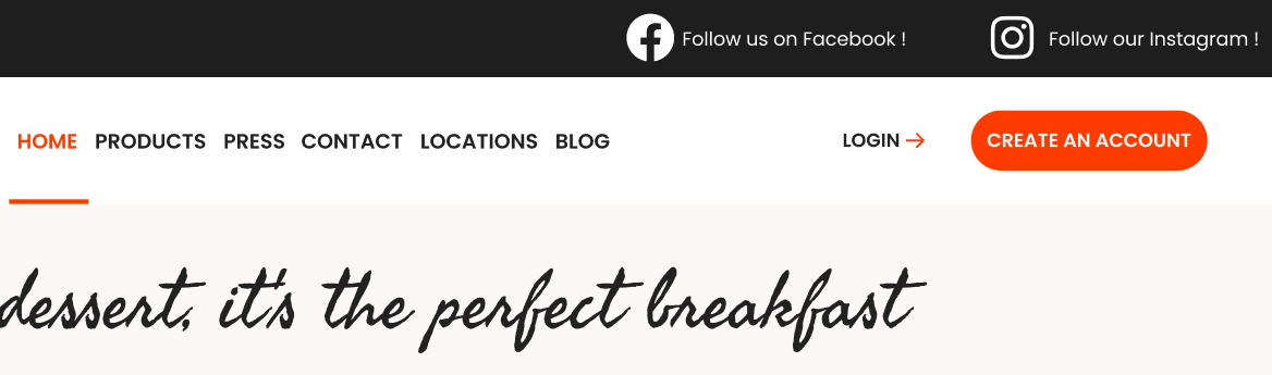
3) The main headline and subheading.
This looks playful but feels geared towards kids rather than women. Also, the font used in the subheading can be changed to appear more feminine.

4) Background color.
The background color is neutral. This can be pushed a bit more towards the feminine side.

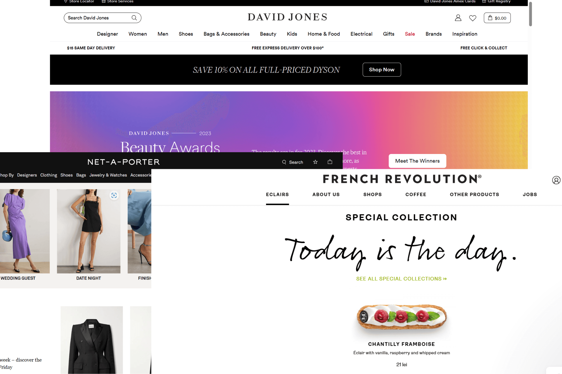
Mood boarding
After looking at companies focusing on women's luxury products and competitors in Romania who sell similar products online, my mood board looked something like this.
Redesign explained..
Header
Using the modern layout trends, The CTAs has been highlighted by use of a different color. The choice for the font would be Poppins. The font is relatively bold than the fonts used regularly in websites like Open Sans, Roboto etc. but does not shout for attention in my opinion. Also, the Call to action for someone very new is to create an account for lead generation purpose, So that has been made to stand out.
Body color
Even though subtle, the website’s color is a very light shade of pink #FCF8F7 to be precise. This gives the feminine boost but does not make the men feel excluded as the redesign here is to encourage women more while also retaining 20 % of the male customers.

Main heading and Subheading fonts
The bold and chunky font followed by a neutral serif has been updated to a script font named “Seaweed script” followed by Poppins for the body. This combination of fonts is rather a distinctive change unlike the other parts which are quite subtle.
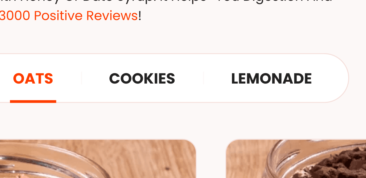
Category Navigation
The category navigation has been made rounded and given a subtle shade of pink which is relatively darker than the body color and the inner color is chose to be white instead of the background color so that it stands out better, visually speaking.
Product cards
The most important part of a website is the part which displays the product. a new redesign of the card has been done to achieve a more modern layout also while not compromising usability.

Newsletter signup form
The newsletter signup form follows the same attributes such as the subtle pink border, the white infill, rounded pill shaped corners and a bold CTA in the brand colors.

Footer
The footer uses the darker shade of pink as a separator followed by pure white footer with the brand colors to represent links.

Conclusion
Given Ohvaz's current €720k annual revenue and 80% traffic from working women in their 30s, strategic improvements could yield:
Conservative Estimate (20% improvement):
Increased conversion rates: €144k additional annual revenue
Improved average order value: €72k-€108k additional revenue
Total potential uplift: €216k-€252k annually
I am very happy to have taken the course by Mr. Cristian Barin. This helped me keep my hands on improving a design with existing rules instead of something like a fresh project where I get to adjust colors as per my connivence.
The Figma file to my project can be accessed here.