I made minor fixes to help increase AVD ( Average view duration ) through minor Navigation fixes, without touching Figma.
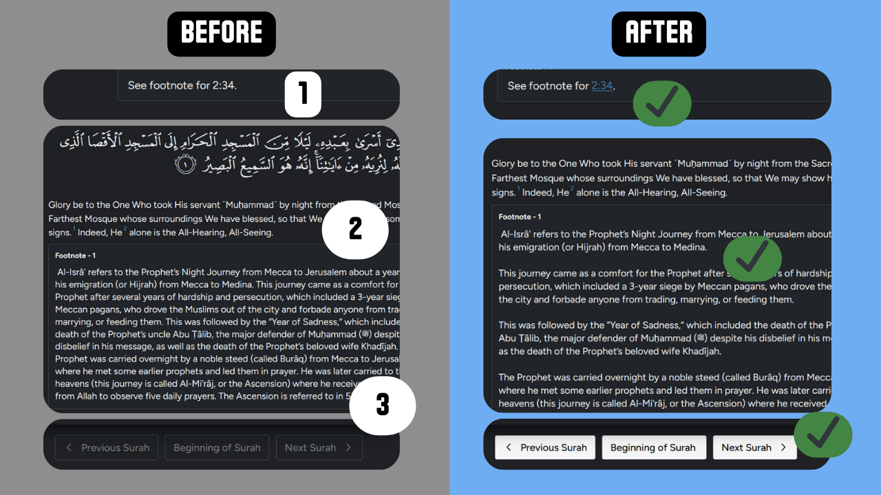
A self-directed heuristic review of navigation, readability, and internal linking
Type: Unsolicited concept work. No client relationship, no brief, no access to internal data.
Role: Sole designer did the research, analysis, UI, prototyping.
Timeline: One weekend Tools: Edit Anything Chrome extension, Similarweb, etc.]
Why quran.com?

Quran.com is among the most-used Quranic reading platforms on the web. It is operated by a non-profit and funded largely by recurring donations, which means engagement and retention are not vanity metrics, they are upstream of the funding model.
I use the product regularly. That makes me a member of the audience but not a substitute for it, and this review is written on that basis: an expert heuristic evaluation by a frequent user, not a research study.
Challenge
Make minor fixes that can increase the average session duration of a user and possibly increase the number of user sign ups which can also help with increasing the number of regular monthly donors, which is the revenue model of this non-profit organization.
Website Analysis
1) Traffic and Device type.
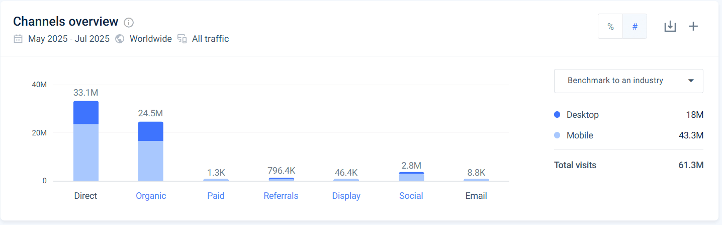
The website has more visits for mobile than desktop, with a very high share of visitors from direct and organic channels.
2) Referrals breakdown
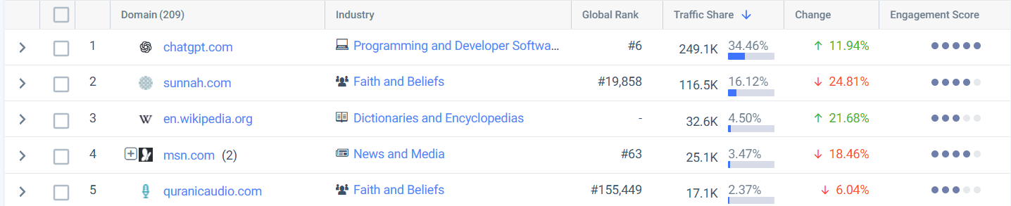
On diving deep into the sources, It seems to be well optimized for SEO with increasing engagement from chatgpt.com and en.wikipedia.org.
This is a good sign that the intended audience incoming is increasing.
3) Engagement Overview
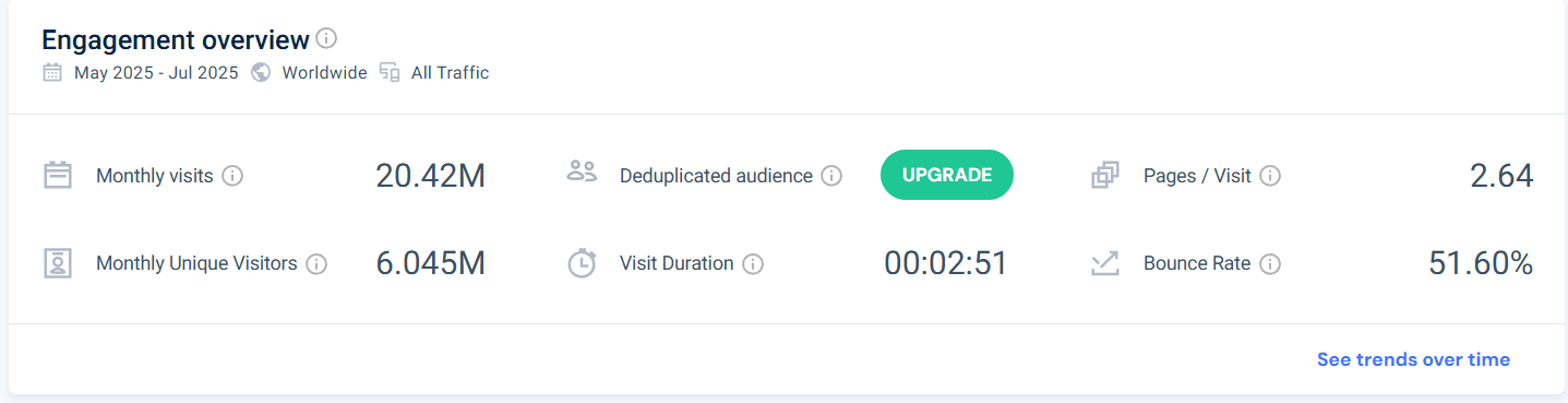
Taking a look at the engagement metrics uncovers some insights.
1) More than 50% of the traffic bounces after the first page.
2) The average pages per visit seems to be only 2.64 per visit.
3) The average visit duration is around 3 minutes.
What I CANNOT know
No internal analytics. No baseline conversion rate, no donation funnel data, no cohort behaviour. Every effect below is a hypothesis, not a projection.
No user contact. No interviews, no usability testing, no session recordings. I could not validate a single assumption about intent.
No design history. I cannot see which of these patterns are deliberate.
Secondary Research
Feeding the data into Perplexity chatbot, I could get the following outputs.
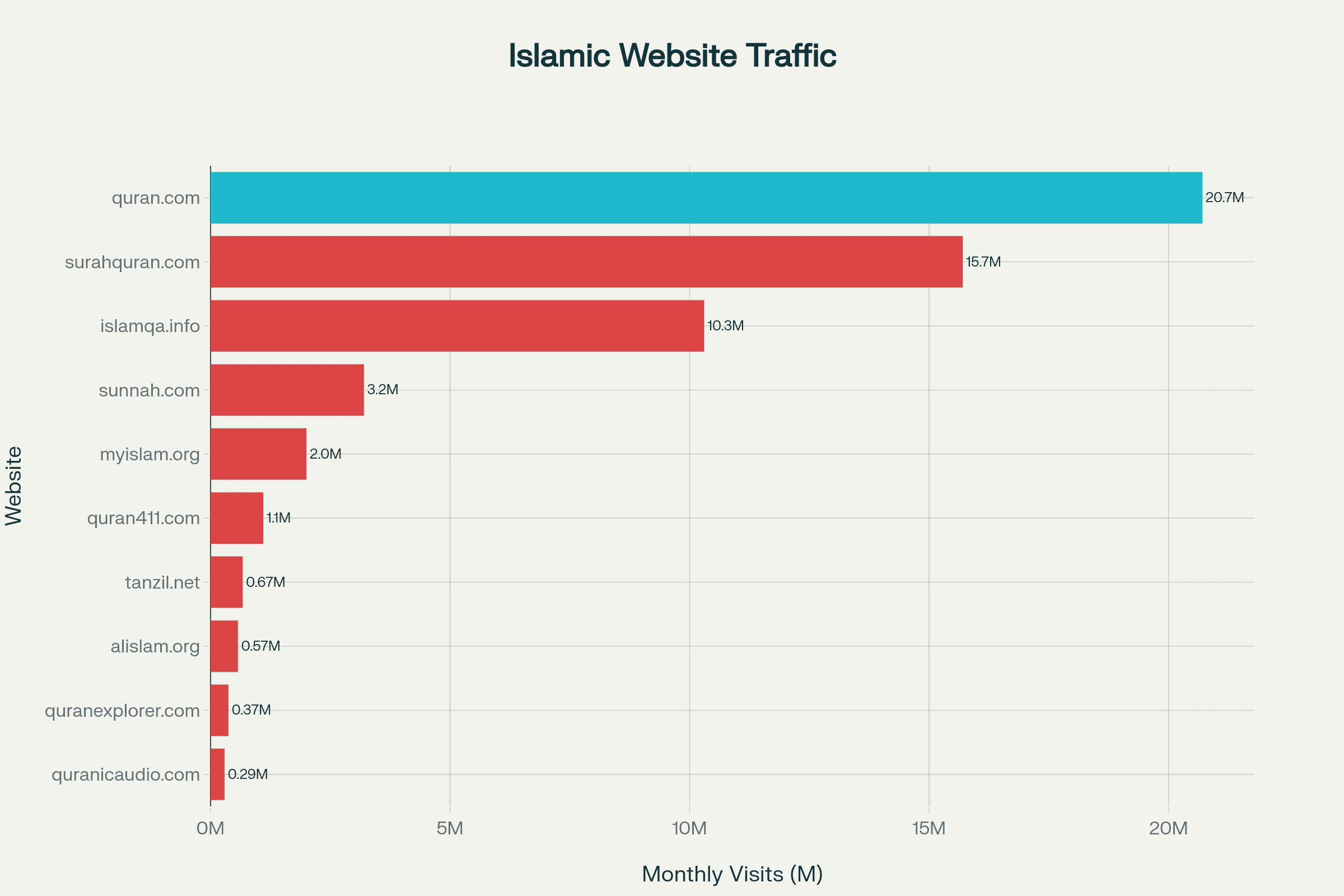
1) Traffic Analysis
This website seems to be leading in the market in terms of traffic which suggests that any improvement in engagement has a much bigger impact.
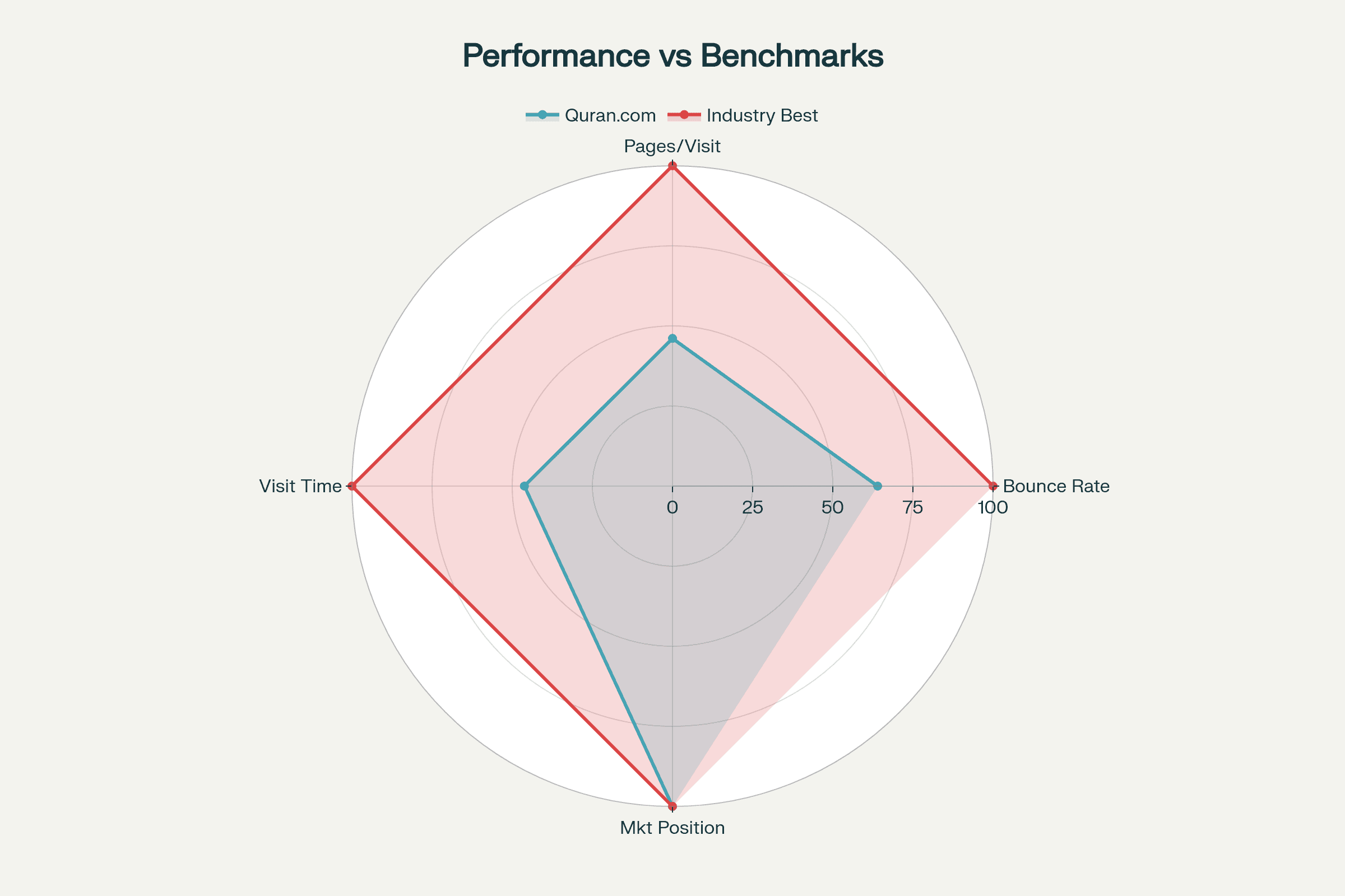
2) Performance Benchmarking
On Researching data from similar web and plotting a radar chart, the overall performance seems well rounded with a dominance in market positioning.
3) Improvement potential
As a first step, without the access to company's internal analytics metrics, we can aim to increase a few parameters.
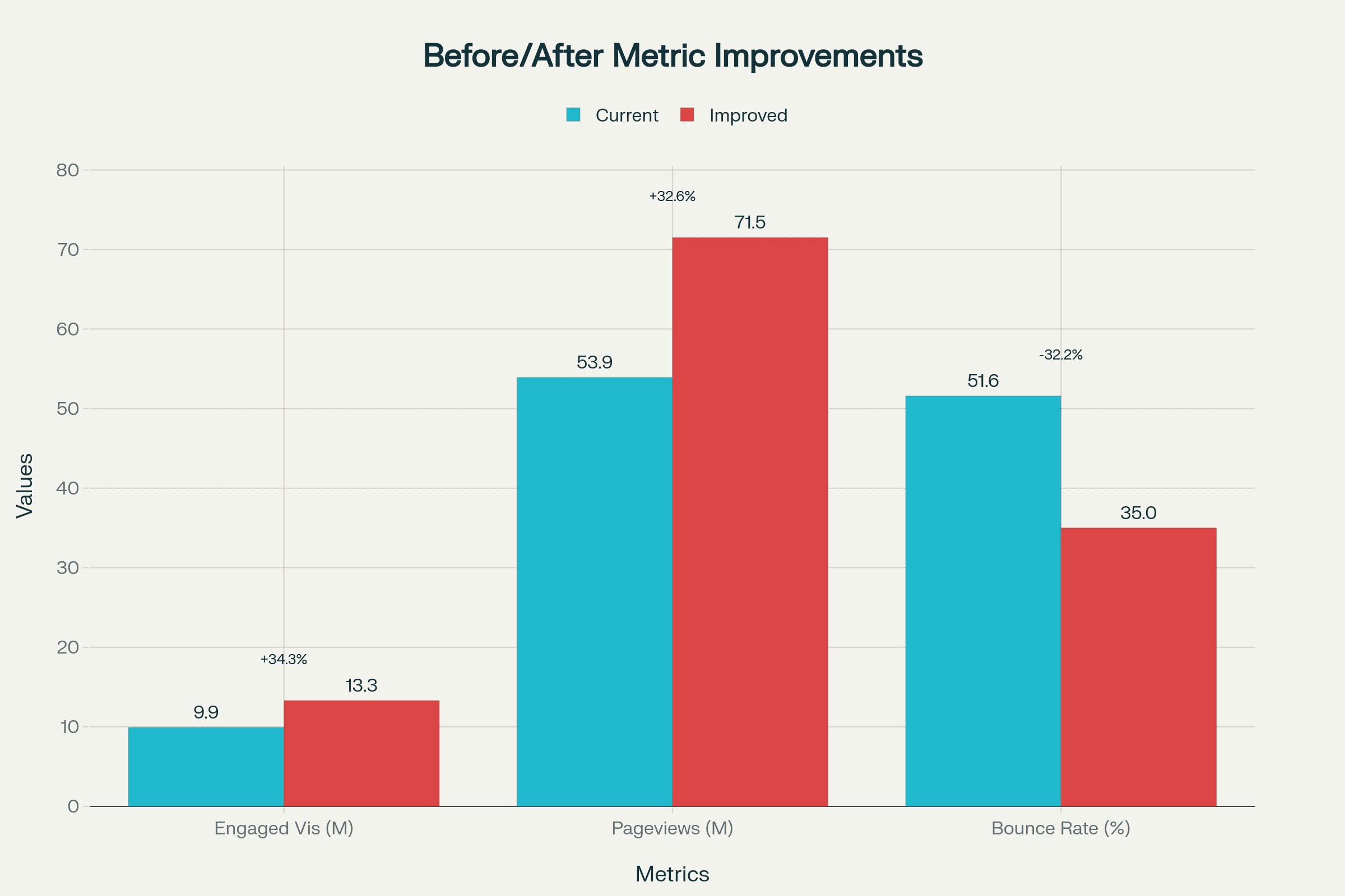
34.3 %
Improved Engagement rate
32.6%
Increase in page views
32%
Decrease in bounce rate
User Journey and painpoints
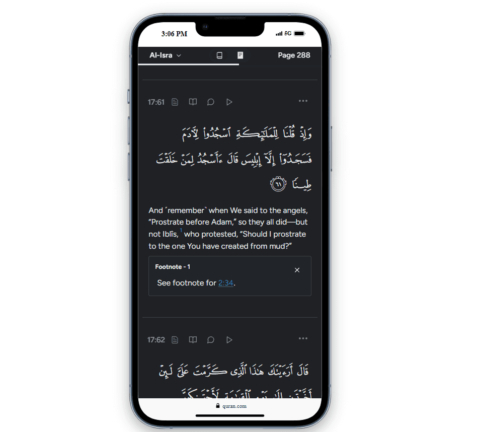
A user selects a chapter and begins reading. Verses requiring explanation carry numbered, highlighted markers. Clicking a marker opens an inline dropdown containing the explanation. At the end of a chapter, previous and next navigation appear as low-contrast buttons.
Three friction points surfaced repeatedly in my own use, and they form the scope of this review: paragraph density in translation blocks, explanation content that terminates in a dropdown rather than a destination, and end-of-chapter navigation that is visually subordinate to the donation call to action.
Redesign
Visual Overload
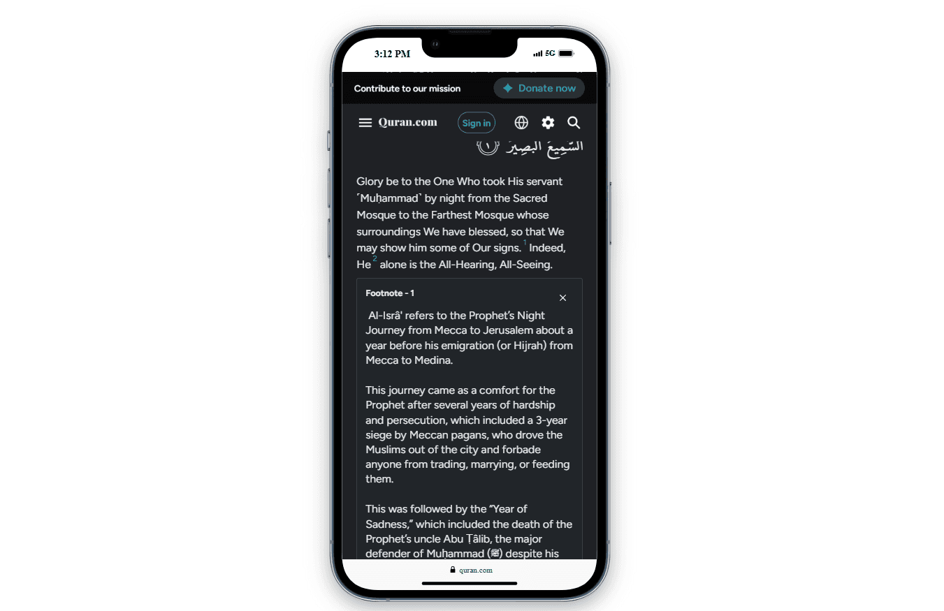
Translation text renders as long unbroken paragraphs with tight leading. On mobile, where the majority of sessions occur, a single verse cluster can fill the viewport with no visual rest.
Instead of having lengthy long paragraphs that are harder to read and digest, having appropriate spacing makes it much more easier to read and understand.
Line length and vertical rhythm govern sustained reading comfort; conventional typographic guidance places comfortable measure at roughly 45 to 75 characters per line, and WCAG 1.4.8 (Visual Presentation, AAA) and 1.4.12 (Text Spacing, AA) both address spacing as an accessibility concern rather than a stylistic one. This is a comprehension issue before it is an aesthetic one.
Also, this can drastically improve session time and decrease bounce rate.
Before
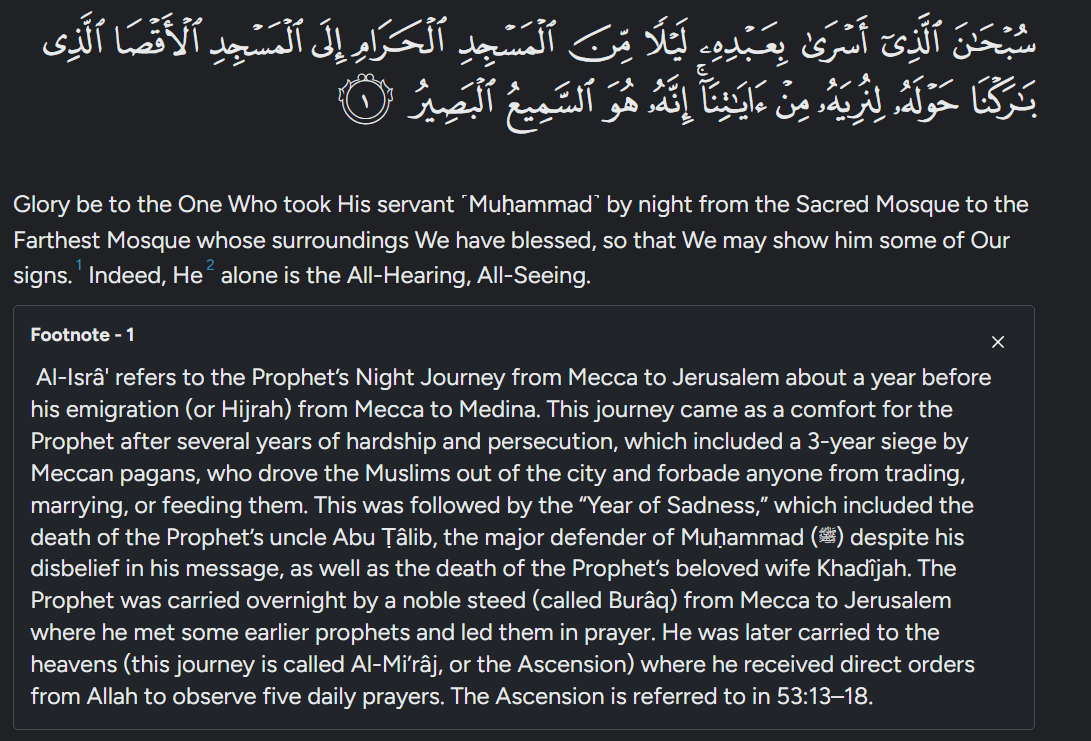
After
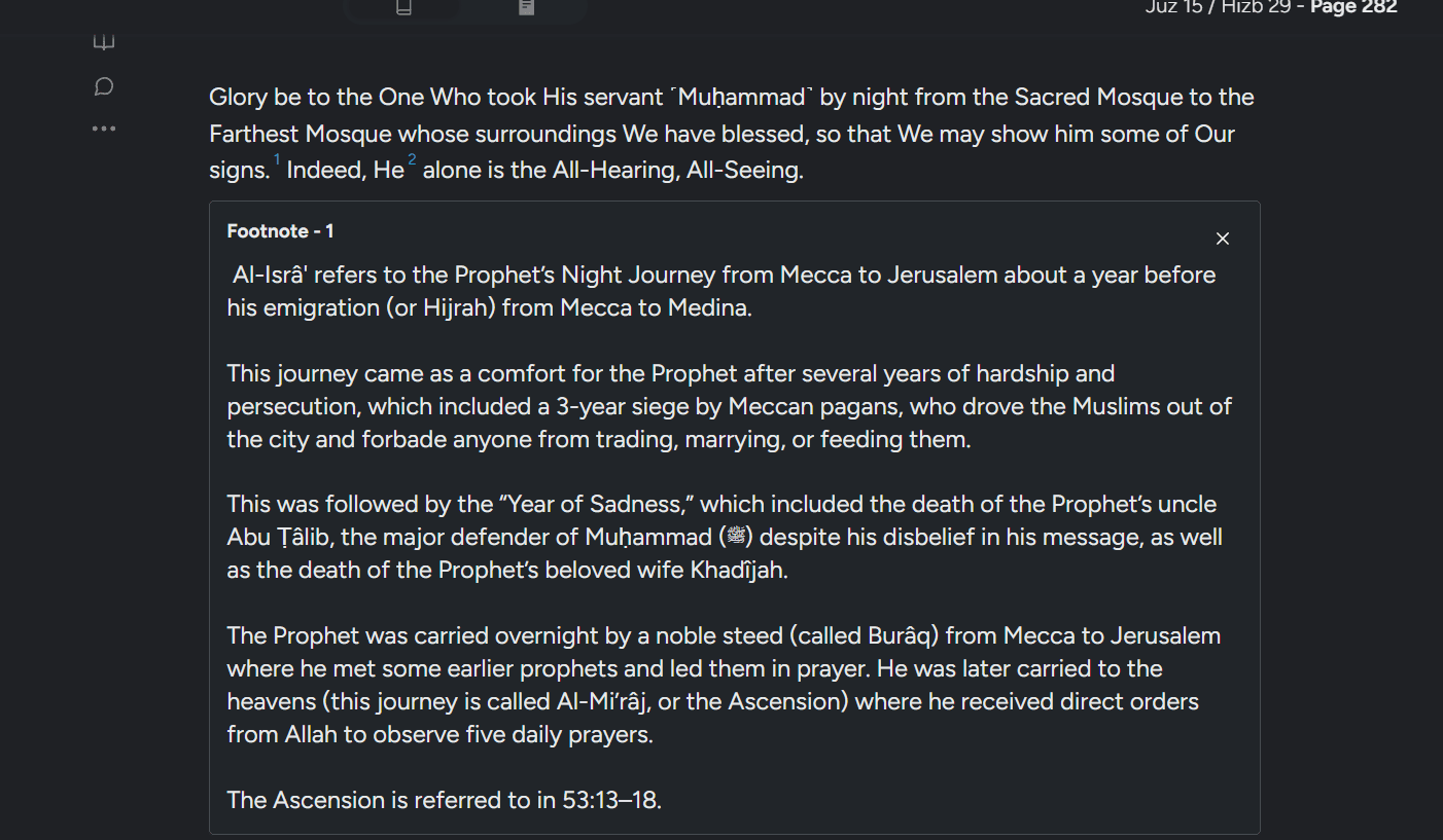
After ( Mobile Version )
Broken User Journey
Numbered explanation markers open an inline dropdown. The content ends there. Where a fuller commentary or related passage exists elsewhere on the platform, the reader is informed of it but not taken to it.
This is an information scent problem. A link's purpose should be determinable from the link and its immediate context (WCAG 2.4.4), and a reader following a thread of understanding should be able to continue following it rather than hitting a terminus.
Instead of just informing user about a further read, linking it directly can keep them in the site for longer and is a better user experience for an immersive read.
This can increase the number of pages , followed by the first change, it can improve the session duration and decrease bounce rate.
Before
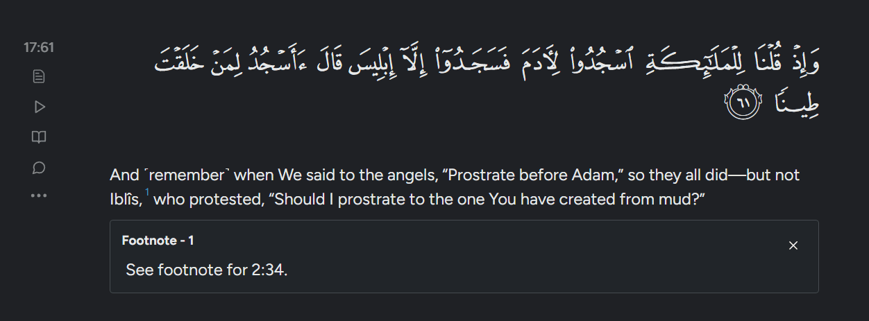
After
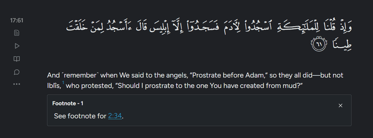
After ( Mobile Version )
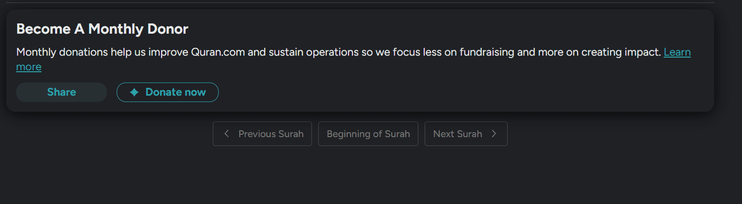
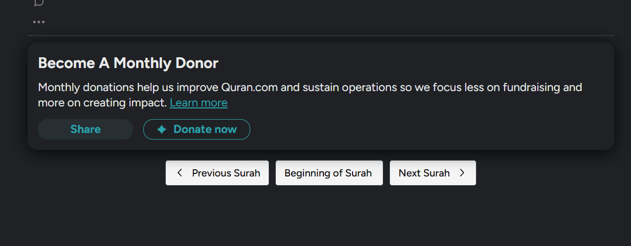
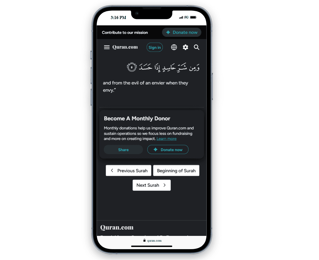
More contrasting Navigation buttons
The Navigation buttons look like ghost buttons and don’t attract attention. Most users primarily would want to read than donate. So it would be better to make the buttons more visible.
The donation call to action carries greater visual weight in the same region.
Principle. Fitts's law and basic visual hierarchy both apply: the control most likely to be needed at that moment should be the easiest to see and hit.
This can help with increasing pages per visit,session duration and also decrease bounce rate.
The tradeoff, stated plainly. Donations fund this platform. Raising navigation prominence relative to the donation CTA trades directly against the revenue surface, and I am not going to pretend otherwise. My bet is that a reader who finishes a chapter and continues to the next is a reader who returns and that recurring donors come from sustained relationships with the product rather than from a single well-placed button at a moment of low intent.
That is a bet on lifetime value over immediate conversion, and it is falsifiable.
Before
After
After ( Mobile Version )
Business Value
Enhancing a website's user experience (UX) through improved readability, strategic internal linking, and streamlined navigation can significantly impact user engagement and, consequently, the site's revenue.
1. Improved Readability through Proper Paragraph Indentation
Enhancing readability by using proper paragraph indentation reduces cognitive load, making content easier to digest.
This improvement can lead to increased user engagement and higher conversion rates. For instance, a study by Portent analyzed 33 websites and found that sites with better readability scores experienced higher conversion rates.
Article Link : Portent
2. Adding Internal Links in Relevant Spaces
Strategically placing internal links within your content enhances site navigation, encourages users to explore more pages, and improves SEO by distributing page authority.
InLinks highlights that internal linking enhances navigation and user experience, which can lead to better indexing by search engines and improved rankings.
Article Link : InLinks
3. Facilitating Navigation Between Previous and Next Pages
Simplifying navigation between pages reduces bounce rates and keeps users engaged longer.
According to Quattr, internal links encourage users to explore more content, lowering bounce rates and increasing dwell time—key metrics for enhancing user experience.
Article Link : Quattr
Estimating the Revenue Impact
While exact figures depend on the site's current metrics, implementing these UX improvements can lead to measurable revenue growth. For example, enhancing readability and navigation can collectively boost conversion rates, leading to increased sales or sign-ups. A study by Nebula Design emphasizes that readable content leads to lower bounce rates, higher dwell times, and improved conversions.
Article Link : Nebula Design
While individual improvements have their own benefits, their combined effect can be substantial. However, it's important to note that these enhancements may overlap in their impact, and the total increase in conversion rates may not be a simple sum of individual improvements.
Data from the above mentioned studies indicate that
Improved Readability: Up to 60% increase in conversion rates.
Adding Internal Links: Significant boost in user engagement and conversions.
Improved Navigation: 18.5% increase in conversion rates.
Conclusion
Considering potential overlaps, a conservative estimate would be a 20% to 30% increase in conversion rates upon implementing all three enhancements. This may exist in more active donors to the Quran.com initiative.